Your Most Common Complaints Aren't Your Biggest Problems: Here's What Is
Most teams waste months fixing high-volume complaints with minimal score impact. This framework reveals hidden-impact issues in days using impact analysis, not volume.
From Ignored to Indispensable: The Proven, Step-by-Step CX Insights Mastery Blueprint in < 6 Days!
This free, 6-day email course walks through a proven process to turn customer feedback into career growth, strategic influence, and a seat at the executive table in 30 days.
High-volume complaints ≠ high-impact problems. This framework shows you how to calculate real impact (not just frequency), segment by customer value, and build priority matrices that executives approve. Includes real examples from OrionAir (+1.6 NPS), Melodics, and Atom Bank (69% call reduction).
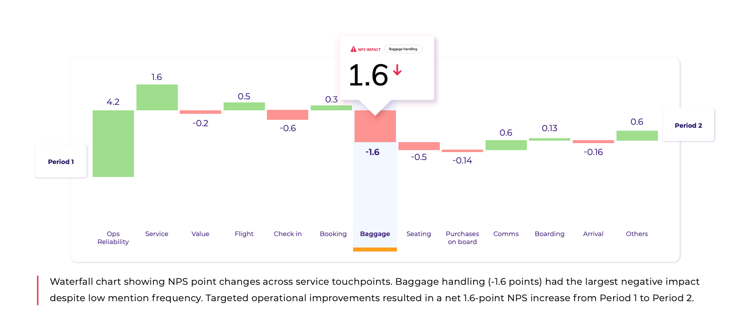
Orion Air spent six months fixing service complaints. NPS barely moved.
Why?
They were fixing the wrong problem.
Service complaints showed up constantly in feedback. Leadership treated volume as priority. The dashboard said "fix this first."
Baggage issues? Mentioned far less frequently. Seemed minor.
Here's what the data actually showed:
Baggage handling wasn't the most frequently mentioned issue, but it had a disproportionate impact on NPS and customer lifetime value. That lower-volume problem cost 1.6 NPS points. More than any other issue.
The service complaints that dominated their dashboard? Those had minimal score impact.
This isn't unique to Orion Air.
Every complaint spike we analyze follows the same pattern. Teams chase volume because it feels urgent. The problem mentioned most often must matter most.
Except frequency measures noise, not damage.
Today, you'll learn the framework that finds your real priorities:
Why complaint volume predicts nothing about business impact (the volume vs impact problem)
The 3-step context analysis that reveals what customers actually mean
How to segment complaints by customer value (same issue, 10x different damage)
The impact-effort-value matrix that builds executive-approved roadmaps
Not just theory. The exact process companies like Orion Air, Melodics, and a large grocery retailer use to turn complaint spikes into targeted improvements.
Let's start with why your dashboards may be lying to you.
Why your most common complaints don't drive churn (the volume vs impact problem)
Most teams prioritize like this:
Issue A: 40% of customers mention it → urgent priority
Issue B: 8% of customers mention it → back burner
Here's the problem: Frequency measures noise, not damage. The issues causing the most business pain often hide in the data you ignore.
Melodics, a music learning app, discovered this when analyzing post-launch feedback.
"More lessons" requests dominated their feedback. The volume suggested this was critical. Leadership planned months of curriculum development.
"We could also see that lots of people wanted more lessons in the app, but, interestingly, lessons are not that important to the actual score."
The real score killer?
App lag. Mentioned far less frequently but causing significant NPS damage.
Here's what the comparison revealed:
High-volume requests (minimal score impact):
More lessons: Highest mention rate, barely affected NPS
Music theory modules: 4th most mentioned, minimal score impact
Low-volume issues (major score damage):
App lag: Lower mentions, significant NPS damage
Usability friction: Quiet in feedback, killing adoption
Melodics prioritized lag fixes first. They avoided months building theory modules that wouldn't move the score.
Calculate impact for every theme:
Impact Score = Overall Average NPS − Theme-Specific Average NPS
Translation: Compare your baseline score against the score from customers who mentioned each specific issue. The gap reveals real damage.
“Thematic's value immediately shone through [by] helping us understand the things that really matter. The most valuable tools for me are Thematic's impact and comparison tools. It's clear, visual, and quick to see the impact. It's just right. Other analytics platforms have reports or word clouds, but they don’t provide anything substantial or meaningful.” - Sam Gribben, CEO of Melodics
How to apply this
Run impact analysis on your last 90 days of feedback. Compare complaint frequency against actual score impact. Sort by impact, not volume.
You'll discover your priority list is inverted.
The complaints dominating your dashboards often have minimal score effect. The issues mentioned by less than 10% of customers might cost you 15+ NPS points.
This pattern shows up everywhere once you measure it.
What customers really mean: Why context changes everything
Finding high-impact issues is step one. Understanding what customers actually mean is step two.
Take comments at face value and you'll fix the wrong problem.
Two major storms destroyed infrastructure. Feedback flooded their support center. Customers were distressed. The team was exhausted.
Initial analysis flagged a broad "service issues" theme. Customers mentioned repair delays constantly. Leadership prepared to add field crews and speed up repairs.
Then they analyzed context.
Customers weren't just angry about delays. They were frustrated by lack of communication about what was happening.
From Thematic summaries, the insights team "quickly realized their customers were asking for better updates as to what was going on." The repair speed wasn't the primary issue. The information vacuum was.
Watercare shifted strategy. Instead of only accelerating repairs, they implemented proactive status updates and enhanced communication processes.
Result: returned to benchmark service levels within months.
The broad "service" label would have sent them in the wrong direction. Context revealed the actual need.
Why keywords fail:
Words change meaning based on context. Customers use sarcasm. They rely on shorthand. They leave thoughts incomplete.
"Fast service" with a 2-star rating means the opposite of "fast service" with a 5-star rating. Keyword matching misses this entirely.
The 3-step context analysis process
1. Analyze intent, not just words
Look for qualifiers that change meaning: "tried to," "supposed to," "still waiting."
Catch sarcasm and tone that keywords miss.
Interpret incomplete thoughts based on surrounding context.
2. Connect comments to supporting data
Layer feedback with ratings and scores to understand sentiment.
Add account history to see if this is a recurring issue.
Include ticket outcomes to verify if problems were actually resolved.
3. Refine broad categories into actionable themes
Replace vague labels with specific issues teams can address.
Unaccepted mortgage requests had lower complaint volume but affected a high-value segment. These customers were at a pivotal decision point. The frustration during this critical moment caused disproportionate damage.
Atom Bank prioritized mortgage request improvements first, even though mentions were fewer. The segment value justified the focus.
The segmentation framework that reveals priority
1. Segment feedback by business value
Connect complaints to customer data you already have:
Lifetime value and purchase frequency
Account size (B2B contracts)
Region and market
Product tier or subscription level
2. Measure impact by segment
Calculate score impact separately for each group:
High-value vs low-value customers
New vs tenured accounts
Product lines and service tiers
Geographic regions
3. Prioritize with weighted scoring
Priority = Impact × Segment Value ÷ Effort
Translation: A moderate-impact issue affecting your highest-value segment outranks a high-impact issue affecting low-value customers.
Real example from a large grocery retailer:
Department-level NPS analysis revealed massive swings in customer satisfaction across their stores.
NPS impact by department
Department
NPS Impact
Fruit and Veg
-1.3 points
Bakery
-0.8 points
Seafood
-17 points
Deli service
-32 points
The Deli was causing nearly 2x more NPS damage than Seafood, despite both being service departments.
Instead of spreading improvement resources evenly across all departments, they focused on where NPS dropped most. Deli got priority attention.
The targeted approach drove measurable improvements in high-impact areas while preserving resources for other initiatives.
Why segment-based prioritization works
Volume-based prioritization treats every complaint equally. Segment-based prioritization recognizes that a complaint from your $500K enterprise customer deserves different urgency than the same complaint from a $50/month user.
Both matter. But business impact varies dramatically.
The complaints costing you the most money often come from specific customer segments. Find those segments. Prioritize those issues.
Your highest-value customers will notice first.
How to prioritize customer issues: The method that actually works
Most teams stall here. Opinion-driven prioritization creates endless debate. Scores barely move. Resources get spread thin across every complaint.
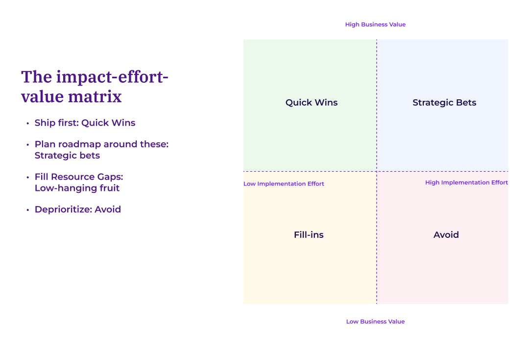
The impact-effort-value matrix eliminates the guesswork
Score each issue across three dimensions:
Impact: Effect on NPS, CSAT, or churn (use the impact formula)
Effort: Time and resources required to fix
Segment value: Revenue importance of affected customers
Then calculate priority:
Priority = Impact × Segment Value ÷ Effort
Translation: A moderate-impact issue affecting high-value customers that's quick to fix outranks a high-impact issue affecting low-value customers that requires months of work.
Plot issues into four categories:
Quick wins: High impact, low effort (ship these first)
Strategic bets: High impact, high effort (plan roadmap around these)
Avoid: Low impact, high effort (deprioritize or eliminate)
Real examples of this framework in action
Orion Air fixed baggage handling first (Quick win) → +1.6 NPS points and measurable revenue gains. The high-volume service complaints? Those were actually low-hanging fruit with minimal score impact.
Atom Bank prioritized unaccepted mortgage requests → 69% call reduction in that category. Lower mention volume, but high-value customer segment at pivotal decision point.
Watercare focused on communication gaps during storms → Returned to benchmark service levels within months by addressing root causes, not symptoms.
Why this framework works
Replaces debate with measurable scoring. Your team stops arguing about what "feels" urgent and starts calculating what drives results.
Shows exact score impact of each fix. You can tell executives: "If we improve this theme by 30%, the score moves by 2.1 points."
Creates executive-approved roadmaps with confidence. Leadership sees the math behind priorities.
Enables scenario planning. "If we improve baggage handling, we gain 1.6 NPS points. If we add those resources to service instead, we gain 0.3 points. The choice is obvious."
The transformation companies achieve with impact-first prioritization:
Impact-first prioritization reduces NPS decline. It accelerates recovery from score drops. It ties CX work directly to revenue with defensible analysis instead of volume-based guesswork.
Your customers already told you what matters. This framework finds it.
Your action plan: Find hidden-impact issues this week
Most teams have the data. They lack the process.
Here's the 5-day framework that finds your highest-impact issues without hiring analysts or buying new tools.
Impact-first prioritisation: timeframe, phase, and actions
Your customers already told you their biggest problems. The 8% complaint that costs 1.6 NPS points matters more than the 40% complaint with minimal score effect.
Impact analysis reveals this in days. Volume analysis hides it forever.
See this framework in action with your data
We've helped companies like Orion Air, Melodics, and Watercare find their hidden-impact issues using automated impact scoring and segment analysis.
The difference between knowing your biggest complaints and knowing your most expensive problems is one analysis.
Find your hidden-impact issues with a Thematic demo.
Share
Link Copied!
Request a demo of Thematic's Customer Intelligence Platform
Thematic turns fragmented feedback into one consistent source of customer truth — so every team acts on the same customer story. Up and running in days, not quarters.
Thank you! Your submission has been received!
Oops! Something went wrong while submitting the form.